Paintings

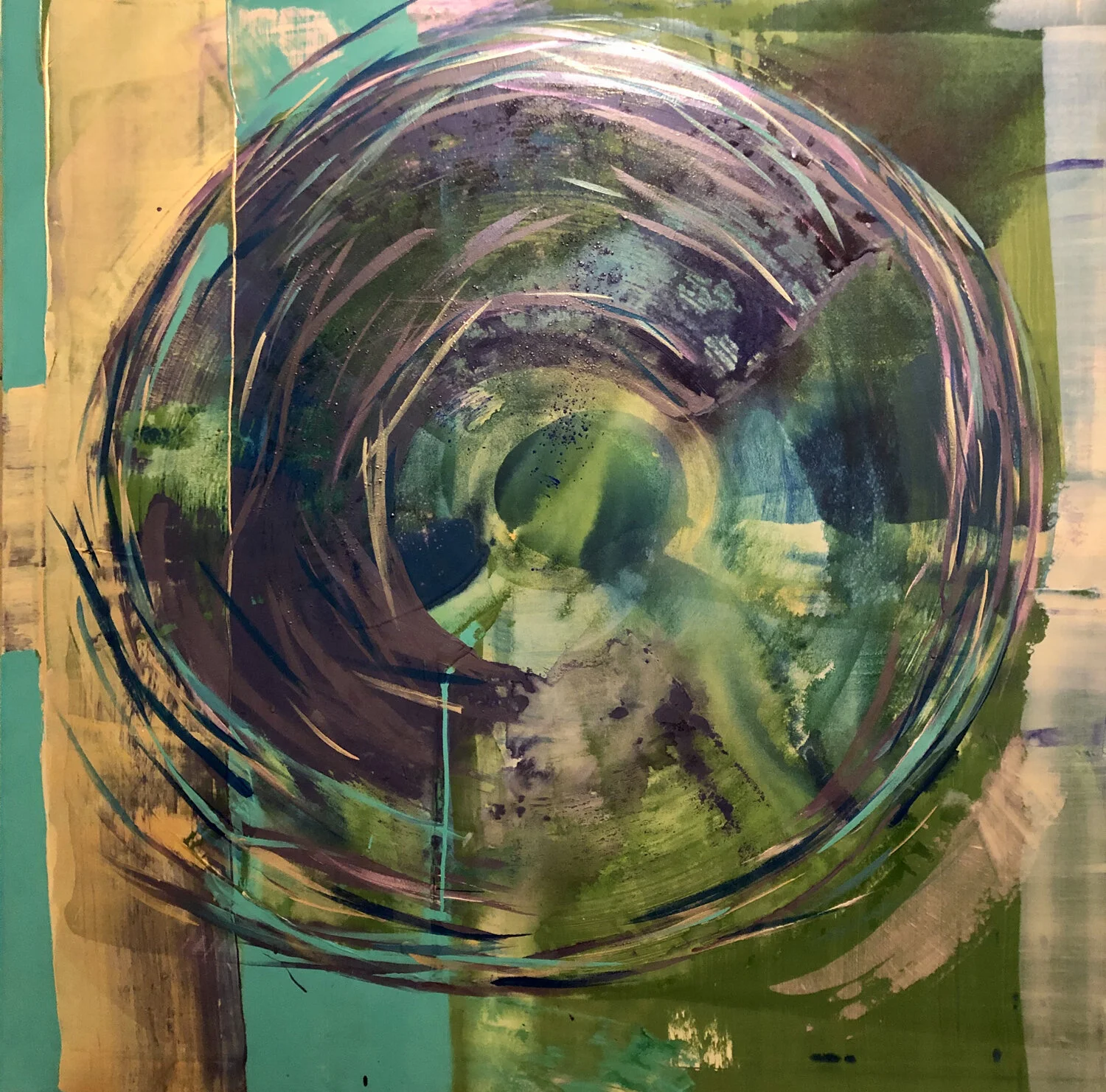
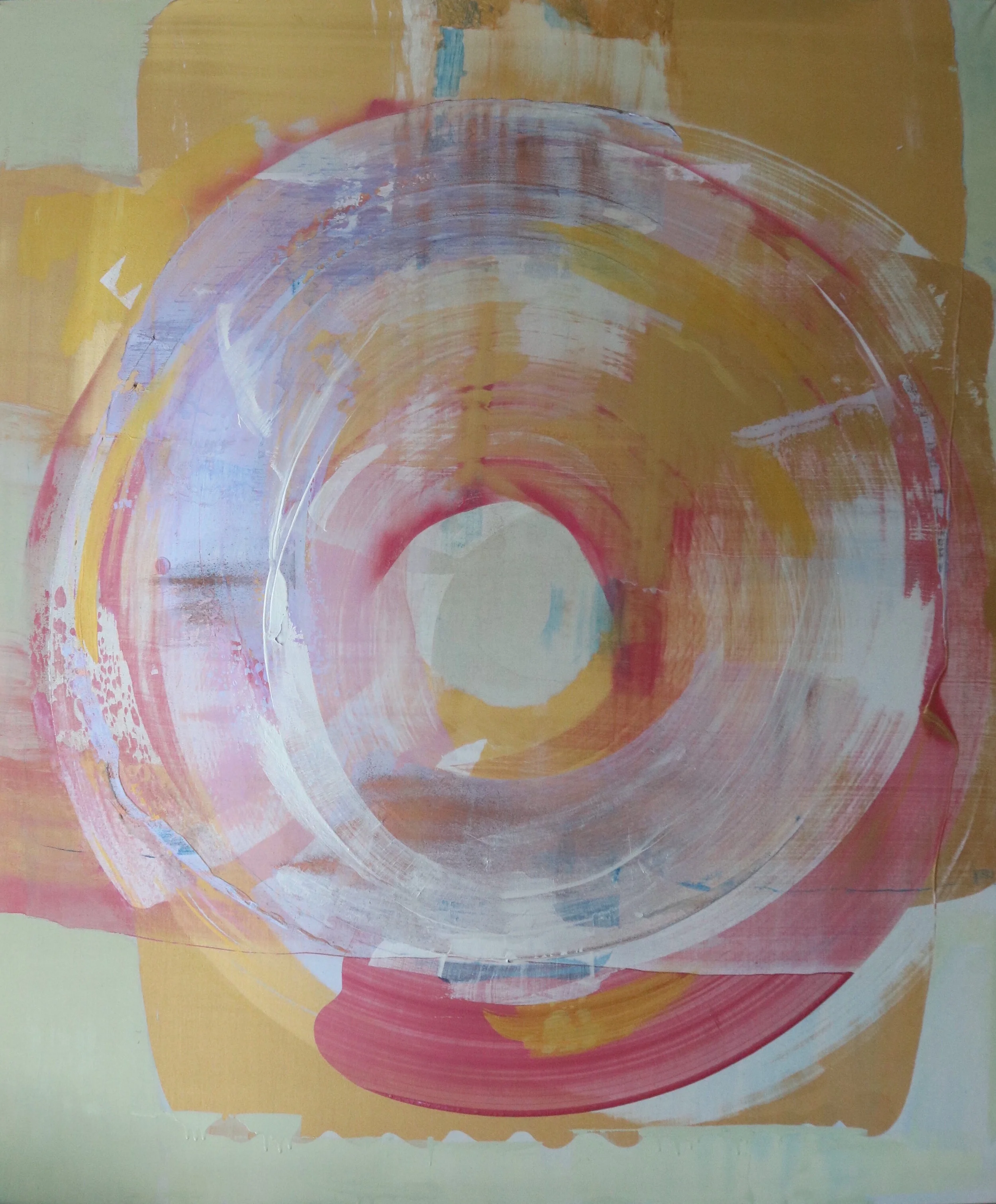
“Ouroboros”
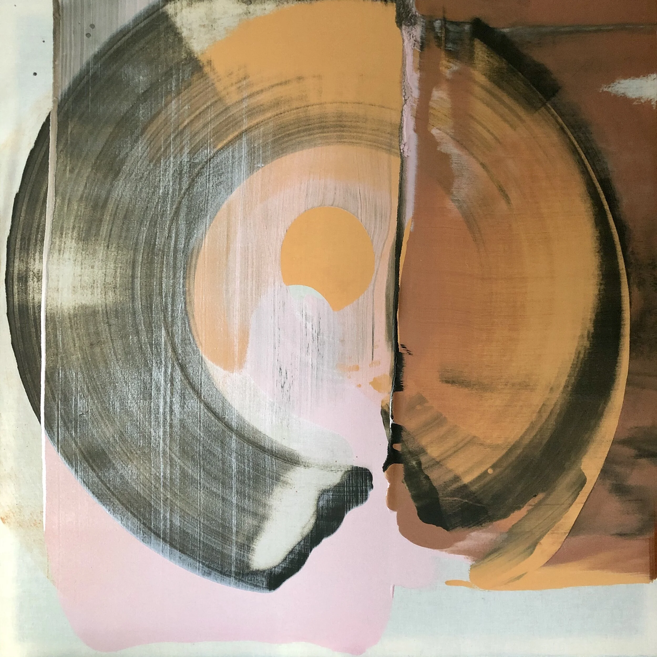
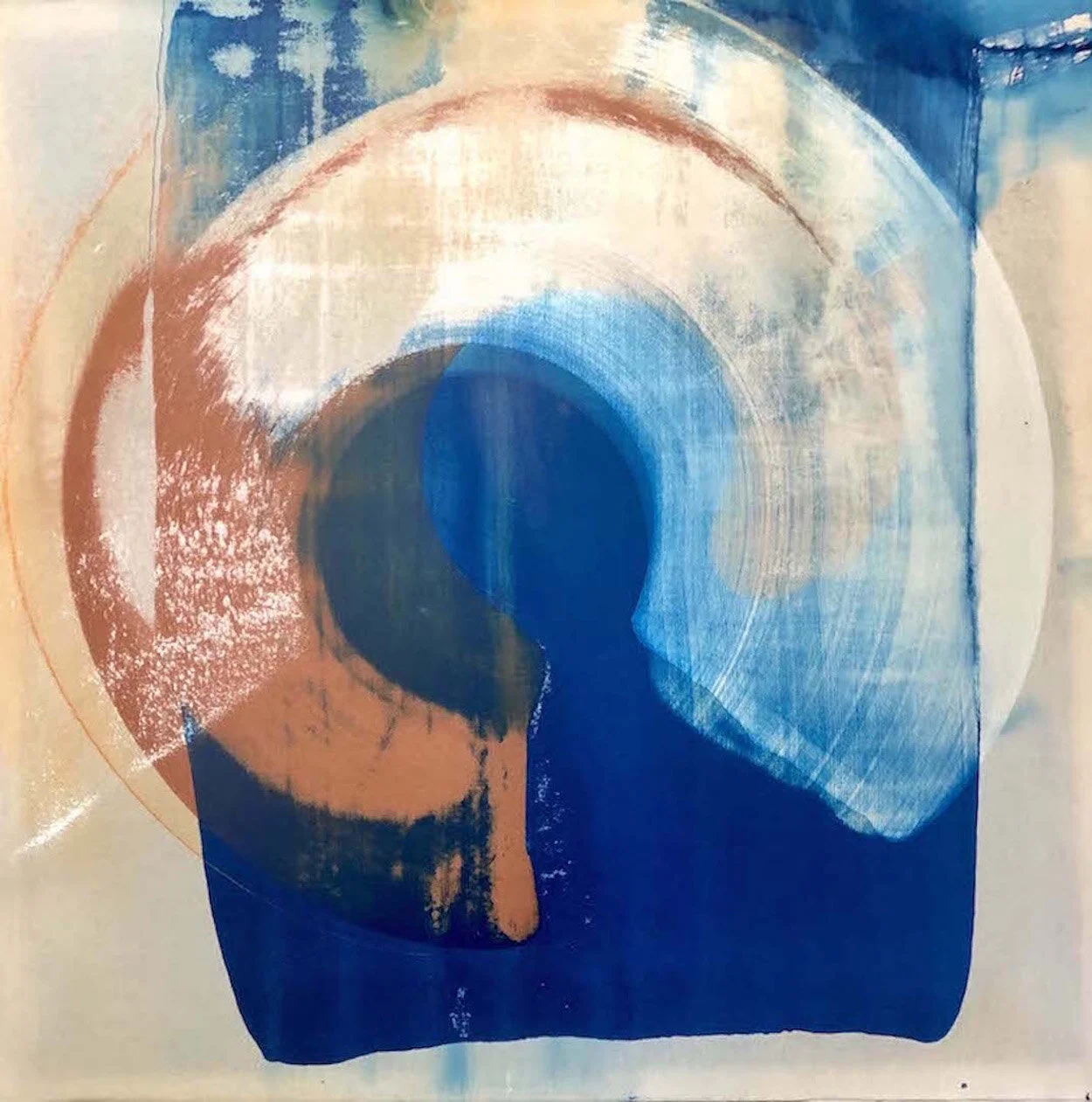
Falling / Floating
These 2 paintings were created for a commission for a residential building on the waterfront in Jersey City. Eventually large prints were made from the original paintings which were used for the final installation. The idea of Falling and Floating I find extremely intriguing. Each conjures up specific images to the viewer but they also feel inextricably interconnected. There is an ominous as well as an uplifting feel to each as well. I hope the paintings imply these contrasting feelings to the viewer.